FANDOM
Fan Central
BETA
Games
Anime
Movies
TV
Video
Wikis
Explore Wikis
Community Central
Start a Wiki
Don't have an account?
Register
Sign In
Try FanCentral
Games
Movies
TV
Video
Wikis
Explore Wikis
Community Central
Start a Wiki
Manage all your favorite fandoms in one place!
Try FanCentral
Don't have an account?
Register
Sign In
Community Central
Manage all your favorite fandoms in one place!
Try FanCentral
Don't have an account?
Register
Sign In
Sign In
Register
Search the world's largest fan wiki platform
Search
MOVIES
Batman Beware: A Chronological History Of Every Live-Action Joker
The Astonishing Animated Evolution Of The X-Men
Anime Fans, Here Are Your Next Obsessions
MOVIES
The Long, Bizarre History Of Beetlejuice 2’s Development
GAMES
Everything you need to know about ‘One Punch Man: World’
MOVIES
How 1994 Became the Year of Jim Carrey
VIDEO
Honest Trailers | Aquaman and the Lost Kingdom
VIDEO
Honest Game Trailers | RoboCop: Rogue City
The Best Moments From SEVENTEEN’s ‘Follow’ Concert
TOP WIKIS
GAMES
Terraria
Minecraft
Genshin Impact
MOVIES
Star Wars
Harry Potter
Marvel
TV
Memory Alpha
Arrowverse
SpongeBobia
ANIME
One Piece
Naruto
My Hero Academia
Plus over
250,000
more to explore
Movies
View All
Popular Wiki Pages in Movies
Harry Potter
Harry Potter Wiki
Neo
Matrix Wiki
Harley Quinn
DC Extended Universe
Snake Eyes
G.I. Joe Wiki
Disney Princesses
Disney Wiki
Godzilla
Monster Verse Wiki
Top News Stories in movies
TJ Dietsch
5d
Batman Beware: A Chronological History Of Every Live-Action Joker
Fandom Staff
Mar 27
7 Movies To Stream On Max Right Now
Joey Esposito
Mar 8
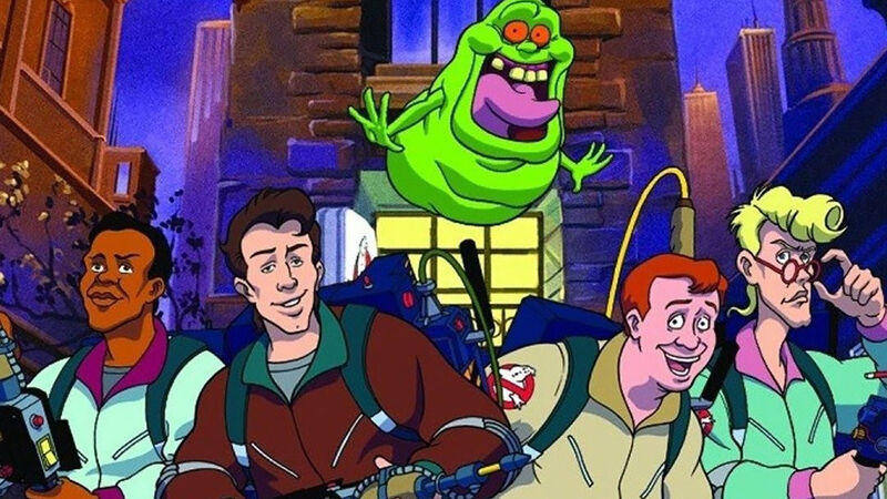
11 Real Ghostbusters Cartoon Episodes To Watch Before Frozen Empire
Before NYC freezes over, here are 11 essential animated Ghostbusters episodes for you to watch.
Joey Esposito
Feb 23
The Long, Bizarre History Of Beetlejuice 2’s Development
Beetlejuice is finally coming back to the big screen for a sequel. It only took decades and many false starts to get there.
Games
View All
Popular Wiki Pages in Games
Ellie
The Last of Us Wiki
Lara Croft
Tomb Raider Wiki
Nathan Drake
Uncharted Wiki
Link
Zelda Wiki
Pikachu
Pokemon Wiki
Rathalos
Monster Hunter Wiki
Mileena
Mortal Kombat Wiki
Miles Morales
Spider-Man Wiki
Top News Stories in games
James Valentine
Feb 1
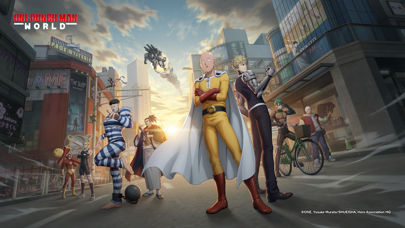
Everything you need to know about ‘One Punch Man: World’
You no longer need to do 100 push-ups, 100 sit-ups, 100 squats, and a 10km run to one punch your enemies
Watch Video
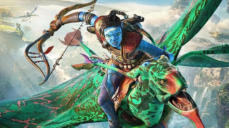
Honest Game Trailers | Avatar: Frontiers of Pandora
Honest Game Trailers plugs its neural link hair braid into Avatar: Frontiers of Pandora, an open world adventure that boasts blue aplenty.
Watch Video
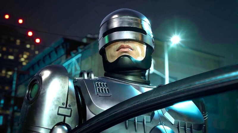
Honest Game Trailers | RoboCop: Rogue City
Get behind the visor of your favorite cyborg peacekeeper as Honest Game Trailers buys RoboCop: Rogue City for a dollar. It's a stellar shoot 'em up!
Watch Video
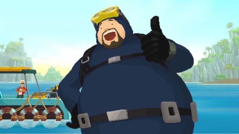
Honest Game Trailers | Dave the Diver
Honest Game Trailers plumbs the depths of indie game - which many feel isn't that "indie" - Dave the Diver, about an overworked dude fishing forever.
Matt Fowler
Jan 15
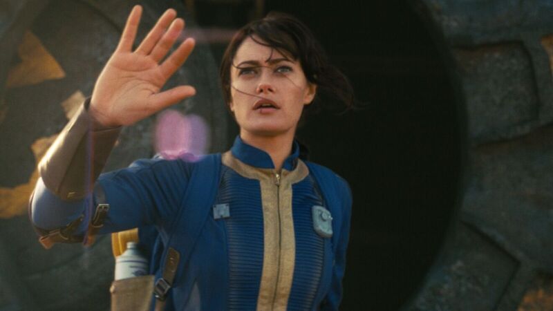
Prime’s ‘Fallout’ Series Explores the Satirical Side of the End of the World
Jonathan Nolan, along with cast members Ella Purnell and Walton Goggins, discuss their new Fallout TV series and why it's not a straight adaptation.
Watch Video
From Dune to Deadpool: 40 Movies We’re Excited for in 2024
2024 bubbles over with blockbuster goodness (we hope!), with Deadpool 3, Furiosa, Dune: Part Two, Joker: Folie A Deux, and Venom 3 leading the pack.
TV
View All
Popular Wiki Pages in TV
Grogu
Star Wars Wiki
Geralt
Witcher Wiki
The Boys S3
The Boys Wiki
Ahsoka Tano
Star Wars Wiki
Zuko (ATLA)
Avatar Wiki
Starfire
Titans Wiki
Sex Education S3
Sex Education Wiki
SpongeBob
SpongeBob Wiki
Top News Stories in tv
Blair Marnell
Jan 22
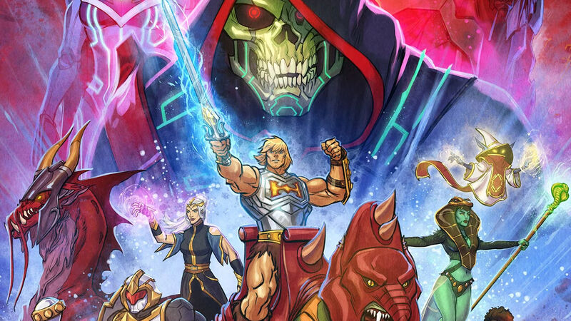
The Animated History of He-Man, She-Ra and the Masters of the Universe
With Masters of the Universe: Revolution making its debut on Netflix, here's a look back at the many animated incarnations of He-Man and She-Ra.
Luis Joshua Gutierrez
Jan 17
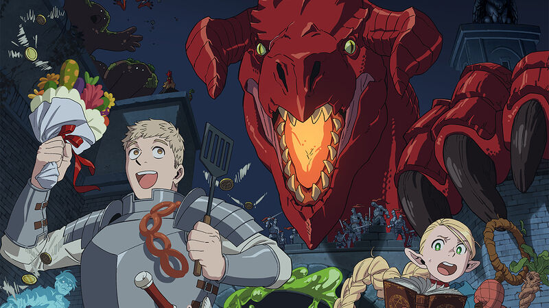
Netflix’s 'Delicious in Dungeon' Anime Captures the Experience of Playing D&D
The new anime series, about monster-hunters intent on eating their prey, impressively evokes what it's like to actually play Dungeon and Dragons.
Matt Fowler
Jan 11
Adam Copeland On Bringing Ares to Percy Jackson and His Dream Final Match
Adam "Edge" Copeland talks to Fandom about squaring off against Percy Jackson as Ares and battling longtime friend Christian in AEW.
Blair Marnell
Jan 10
8 Questions We Have After the Echo Finale
If you've finished your binge of Echo, here are there lingering questions we have about Maya, Kingpin, Daredevil and more.
Blair Marnell
Jan 9
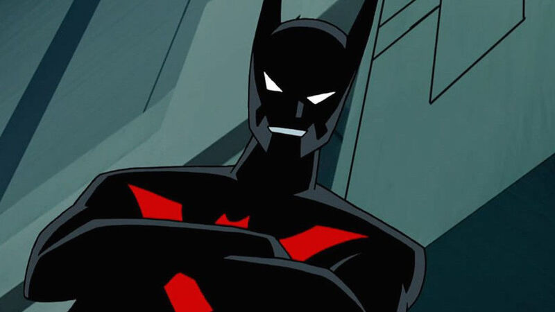
How Batman Beyond Has Lived on Beyond the Animated Series
With the 25th anniversary of Batman Beyond here, we look at how Terry McGinnis has continued to live on in other stories since.
TJ Dietsch
Jan 8
Origin Story: Echo's Ties to Daredevil and Kingpin Go Way Back
With buzz rising for Marvel's Echo series, thanks to an exciting and brutal trailer, we dive into the character's history.
Search the world's largest fan wiki platform
Search
The latest trends, delivered straight to your inbox.
Stay up to date on all the latest in gaming and entertainment.